 1 Mar 2020-23 Apr 2026
Location analysis in relation to the realization of 4 murals on 4 end walls.
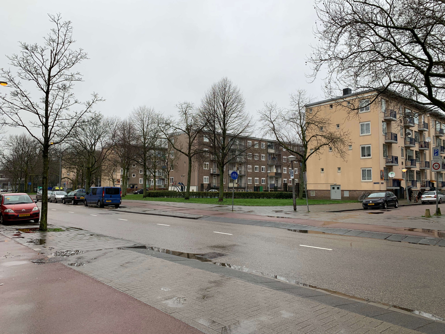
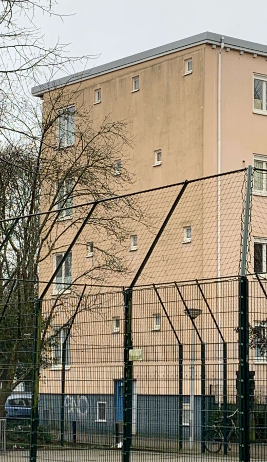
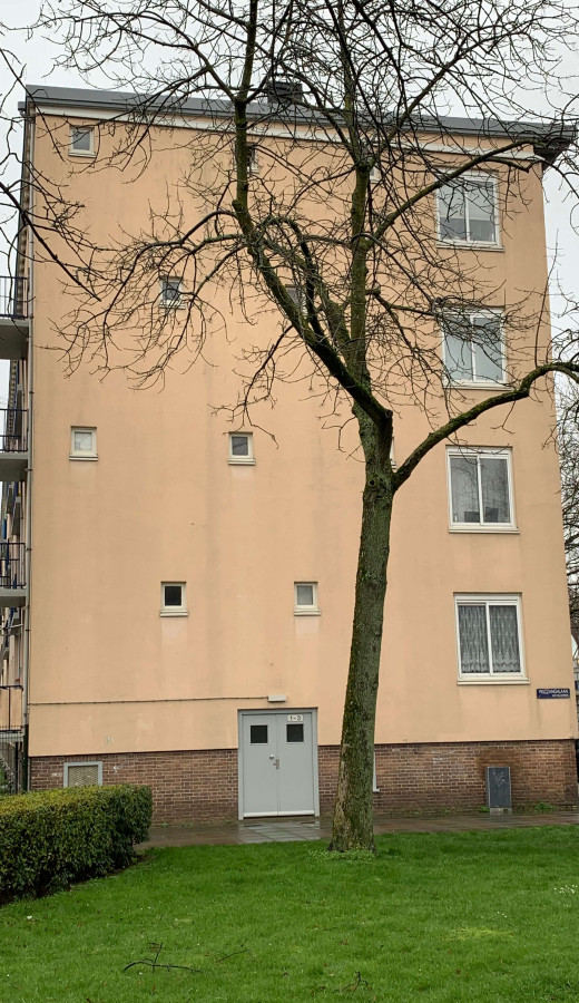
The 1st impression upon arrival at the location where the 4 end walls are situated was; ‘beautiful walls but a lot of distractions’. The trees in front of them that carry leaves again in summer, the walls themselves with large and smaller windows where 1 wall has a picture-perfect surface, playgrounds and garbage containers. The views of the flats play into the overall picture from different perspectives. This also means a lot of noise in the form of balconies with occasional colored screens around the balustrades, satellite dishes, in summer there will also be hanging laundry, some flats consist of brick others have plaster as a finish. In short, the end walls require a counterbalance in the form of a clear and calm image that in its tranquility and clarity still make a very powerful statement. This implies that there should be murals that give the neighborhood a universal and elegant appearance, where everyone feels comfortable and where everyone actually feels that the neighborhood is truly improving. I am talking here about a timeless experience and not a quick temptation that at some point also becomes ordinary again but creates a lasting (unconscious) disquiet.
The origin of mural art from the 20th century onward was to highlight architecture or to enhance architecture. Later, murals were conceived more as an autonomous feature, and certainly in relation to the “Amsterdam School”, they were also used to introduce residents, users and passers-by to visual art. This resulted in beautiful works that are still of great value, even for users and passers-by.
Resident participation
A first task was to create support among all the apartment dwellers.
Currently, it is increasingly common to involve residents and users in the development of their living environment. This is a good development but requires a clear direction, especially when it comes to image-defining additions. The interplay between user and artist/curator can be quite surprising.
From a strong basis with a starting point / theme that appeals to everyone's imagination, a serious approach can be established within a short period of time that increases solidarity and ultimately results in four powerful walls that provide real added value to the neighborhood.
Creating support and participation
FOUR IN A ROW
To bring the project to life among the residents, it is also important to give the project a name. The first inspiration was 'Four in a Row', which is also the name of a fun and clever game. This name triggered a string of associations, including the use of board games as the basis for a design direction.
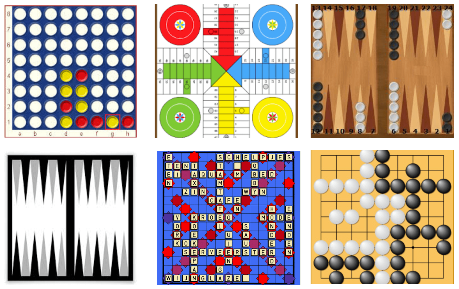

Every country worldwide has a long tradition of board games.
The visual appearance of (board) games is fascinating. Colorful abstractions, symbols, simplification of reality (monopoly, goose-board, strategy), the appearance of the games is accompanied by a brightness that lends itself well to the basic walls. Popular board games were inventoried, especially also from the countries represented in this district, the examples are numerous.
Games bring fellowship. An example:
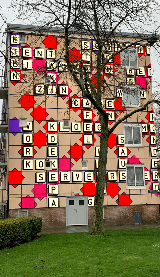
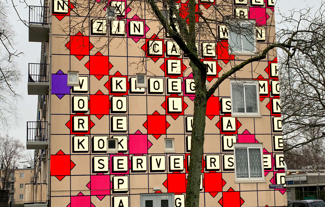
Scrabble is a letter game sold in 121 countries in 29 languages. It is a board game for two to four players or player teams, in which words must be placed on a game board with a given number of random letters. Here, luck and ingenuity go hand in hand, as the letters are picked at random and the trick is to achieve the highest possible score with them. In addition to the Latin alphabet, it also appears in other alphabets, such as Hebrew, Arabic, Cyrillic, Greek, Chinese, Japanese and more. A Braille version is also available. The game gained popularity in 2011 with the appearance of a digital version, of Word feud. The app became available on smartphones and others and was soon played by users around the world.
A game like scrabble is also very interesting visually.
The possibilities of using this theme to achieve beautiful results in a connecting way are endless. Visually, the games are often based on mathematical and geometric principles, making proportions correct and thus very soothing to the eye and mind.
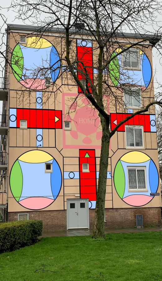
Enlarging a game (on a large wall) is one thing, transforming it into art is another. The production assistant of Murals Inc, Pepijn Boudewijns, who is very versatile and also has a graphic design education, has translated a game in his way to one of the walls with extraordinary results. At the heart of the left image is HOME displayed, a wonderful touch and shows how much these games are taken from life. The game is called ‘Parcheesi’ and is the Moroccan version of ‘Mens erger je niet’.
Murals Inc. wants to ask three Artists to transform the games suggested by local residents into a mural. This implies that the games will remain recognizable but will be reworked to create an interesting image that does justice to the environment and the choices of the residents, but also incorporates qualities inherent in visual art.
Within the database, there are artists who could do this. They work with graphic patterns or with text. They could also be deployed much earlier in the process to create designs together with local residents based on existing games.
